Inkblot is a gem for interacting with Waveshare's line of E-paper displays on the Raspberry Pi using ruby. It includes components for outputting images, text, and menus to the EPD as well as reading input from HAT buttons on the side.
Add this line to your application's Gemfile:
gem 'inkblot', github: 'jtp184/inkblot'You can also download and install it globally with
git clone https://github.com/jtp184/inkblot.git
cd inkblot
rake install
For help setting up your pi for use with this gem, check out the RASPI_SETUP instructions.
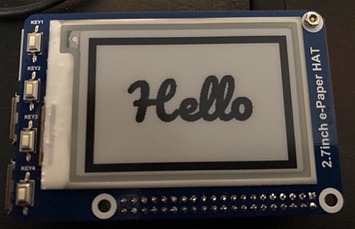
This gem was developed using Waveshare's 2.7 inch e-Paper HAT on the Raspberry Pi 3+ and 4. Component aspect ratios and button pinouts are based on this screen size, but you can override them with module level writers. Be sure to set these before using any of the relevant functions.
Inkblot.screen_size # => Defaults to { width: 264, height: 176 }
Inkblot.screen_size = { width: 200, height: 200 }

Inkblot.button_pinout # => Defaults to [5, 6, 13, 19]
Inkblot.button_pinout = [6, 11, 12, 14] # Uses different pinsAll methods and classes are RDoc documented at https://jtp184.github.io/inkblot/
The Display class handles outputting to the screen. It accepts an argument to its .show method to output to the screen, which can be any number of displayable objects.
items = []

# Primarily used to display Components and Converters
items << Inkblot::Components::SimpleText.new(text: 'Hello')
items << Inkblot::ImageConverter.new(path: '/home/pi/img.png')
# Can also display (already correct bmp) files directly or by path
items << File.new('/home/pi/bump.bmp') # Or a TempFile
items << '/home/pi/bump.bmp'

# call, show, and [] all work
Inkblot::Display.call(items[0])
Inkblot::Display.show(items[1])
Inkblot::Display[items[2]]
Inkblot::Display.(items[3])

# Plaintext also works
Inkblot::Display.("Show Me")
One of the easiest ways to start using Inkblot is to add a #to_display method on your object which returns a component.
class SomethingToShow
  def initialize(smth)
    @something = smth.to_s
  end

  def to_display
    Inkblot::Components::SimpleText.new(text: @something)
  end
end

Inkblot::Display.show(SomethingToShow.new("Cinnamon Buns"))The EPD can operate in 1-deep and 4-deep color modes, with an accessor on the module to swap between them.
Inkblot.color_depth # => Defaults to 1

Inkblot.color_depth = 4 # For Init_4GrayThe Buttons class deals with input from the HAT buttons. The buttons communicate over the Pi's GPIO pins, and can be used for a broad variety of inputs.
# Setting up the buttons for use. This only needs to be run once at the start
Inkblot::Buttons.init
# You can check whether the buttons have been initialized with
Inkblot::Buttons.ready? # => true

# Basic input from buttons. With no argument, blocks until you press a button then returns an index
Inkblot::Buttons.get_input # => 0

# With an argument, it will timeout if no button is pressed.
Inkblot::Buttons.get_input(10) # => nil if no button is pressed for 10 seconds

# It's also possible to get chords instead of single presses.
# Specify the chord length and wait for simultaneous presses.

Inkblot::Buttons.get_multi_input(2) # => [1, 2]
Inkblot::Buttons.get_multi_input(3, 10) # => nil || [0, 1, 3]

# You can also record all button activity within a timeframe

Inkblot::Buttons.get_raw_input(3) # => [[], [0], [0, 1]...]

# Unexports GPIO and releases it for other use
Inkblot::Buttons.release
Usually, you'll use the buttons with a display component. Components (and other classes) may have their own defined button actions, and the Buttons class can access them.
class DummyComponent
  def to_display
    Inkblot::Components::SimpleText.new(text: "Dummy")
  end

  def button_actions
    [
      -> { puts "Key1" },
      -> { puts "Key2" },
      -> { puts "Key3" },
      -> { puts "Key4" }
    ]
  end
end

c = DummyComponent.new

# First we have to display the component
Inkblot::Display.show(c)

# Gets input, and runs the proc at the associated index.
Buttons.get_press
# e.g. Pressing "Key1" on the HAT runs c.button_actions[0].callThe Converter class and its subclasses are used to transform input data into other forms, with the end goal of being able to display it on the EPD. Converters are used internally by Components to render their HTML, and are first-class displayables in and of themselves.
Abstract parent class for common functionality. It defines the overridable #convert method which is used by the #convert! method to produce the output.
The ImageConverter class can take images on disk, and through ImageMagick resize and convert them into 1-deep .bmp files suitable for display on the EPD.
# Paths
i = Inkblot::Converters::ImageConverter.new(
  input: "/home/pi/img.png"
)

# File and Tempfile objects
j = Inkblot::Converters::ImageConverter.new(
  input: File.new("/home/pi/img.png")
)

# Binary image data
k = Inkblot::Converters::ImageConverter.new(
  input: File.read("/home/pi/img.png")
)

i.convert! && i.output # => TempfileThe DataUrlConverter converts an image input into a base64 encoded data url
# Paths
d = Inkblot::Converters::DataUrlConverter.new(
  input: "/home/pi/img.png",
  format: :path
)

# File and Tempfile objects
e = Inkblot::Converters::DataUrlConverter.new(
  input: File.new("/home/pi/img.png"),
  format: :file
)

# Binary image data
f = Inkblot::Converters::DataUrlConverter.new(
  input: File.read("/home/pi/img.png"),
  format: :binary
)

# Base64 image data
g = Inkblot::Converters::DataUrlConverter.new(
  input: SomeCode.base64_image,
  format: :base64
)

d.convert! && d.output # => "data:image/png;base64,tldxz+pjHnQRDPFjkUUo3A..."The HtmlConverter takes in an HTML doc as input, and transforms it into an image using puppeteer. This image is then piped through an ImageConverter so that it can be rendered on the EPD
html_doc = <<DOC
<html>
  <head></head>
  <body>
    <p>Happy Meal with Extra Happy</p>
  </body>
</html>
DOC

h = Inkblot::Converters::HtmlConverter.new(input: html_doc)

h.image_contents # => \"BM\\xFE\\u0018\\u0000\\u0000\\u0000..."
Components are composable views. They're written as ultra-basic ERB/HTML templates, with scaling applied to look good at the resolution of the EPD. These are then passed into the HtmlConverter. No writing or comprehension of HTML is necessary though, as you merely pass in options to the constructor.
You can provide options to the constructor with standard or block syntax.
Inkblot::Components::SimpleText.new(text: "Works this way")

Inkblot::Components::SimpleText.new do |st|
  st.text = "Or this way"
end
Passed in options can be retrieved through the options method, or defined accessors
c = Inkblot::Components::SimpleText.new(text: "Text")

c.options[:text] # => "Text"
Passing a second hash as a positional argument sets the keys/values as instance variables
i = Inkblot::Components::Component.new({body: "I have a name"}, { name: "Rachel" })

i.inspect # => #<Inkblot::Components::Component:0x... @name="Rachel", @options={:body=>"I have a name"}>
You can also compose components by passing them to Component.create method, which will combine the fragments together into a single page, top to bottom.
Inkblot::Components::Component.create do |cpt|
  cpt << Inkblot::Components::SimpleText.new(text: "Several")
  cpt << Inkblot::Components::SimpleText.new(text: "Different")
  cpt << Inkblot::Components::SimpleText.new(text: "Components")
end
<!DOCTYPE html>
<html>
<head>
</head>
<body style="height: 176px; width: 264px;">
<div style="...">
<h1 style="font-family: monospace; ">Several</h1>
</div>
<div style="...">
<h1 style="font-family: monospace; ">Different</h1>
</div>
<div style="...">
<h1 style="font-family: monospace; ">Components</h1>
</div>
</body>
</html>The Component class is the superclass of all other components, as well as a component itself. Components have a #options method, a hash containing their customization options. The base component has only one relevant option, its body.
Inkblot::Components::Component.new(body: %q(<h1>A Simple Component</h1>))

# You can also set width and height on any component like so
Inkblot::Components::Component.new do |c|
  c.body = %q(<p>small text</p>)

  c.div_height = 100 # height: 100%
  c.div_width = '500px' # width: 500px
  c.div_height = :full # height = Display.size[:height]
  c.fullscreen = true # Same as c.div_height = c.div_width = :full
end
Other components subclass from this, and have their own customization options. Composed components from Component.create are instances of the base component class.
The SimpleText class allows you to do just that, simple text. Sizing can be set explicitly or automatically, as can fonts.
Inkblot::Components::SimpleText do |st|
  st.text = "Example Text"
  st.border_size = 10 # Adds an inner border
  st.size = :large # :tiny, :small, :medium, :large or an integer for px
  # Takes in an array of font names and includes them
  st.gfonts = ['Roboto', 'Open Sans', 'Jost', 'Pangolin']
  # Also works with built in fonts like Helvetica
  st.font = "Pangolin"
endThe FullScreenImage class displays images. You can pass a variety of image sources in, and it works with other components for nesting and resizing. Images are automatically resized and downsampled.
# Sets the img tag src to the url
Inkblot::Components::FullScreenImage.new do |fsi|
  fsi.url = "https://live.staticflickr.com/2753/4177140189_f5fd431b26_o_d.jpg"
end

# Sets the img tag src to the absolute version of the path
Inkblot::Components::FullScreenImage.new(path: "/home/pi/img.jpg")

# Sets the img tag src as a data url from reading the file
Inkblot::Components::FullScreenImage.new(file: File.new("/home/pi/img.jpg"))

# Sets the img tag src as a data url from the file contents themselves
Inkblot::Components::FullScreenImage.new(binary: File.read("/home/pi/img.jpg"))The QrCode class can generate and render QR Codes to the screen, great for small area and two-channel color.
Inkblot::Components::QrCode.new do |qr|
  qr.message = "http://justinp.io/"
  qr.margin_top = qr.margin_left = -5 # adds a -5% margin
endThe BarCode class can generate and render EAN-13 style barcodes.
Inkblot::Components::BarCode.new(code: "123123123123")The TableList class displays up to 4 line items in a horizontal table view. If you supply fewer than 4 items, blank entries are produced to keep 4 lines.
Inkblot::Components::TableList.new do |tl|
  tl.items = ['Apples', 'Pears', 'Oranges', 'Bananas']
endAn IconGroup is a grid of icons / images to display horizontally next to each other. Column count is customizable, rows are subsequently determined by amount of content.
Inkblot::Components::IconGroup.new do |ig|
  ig.icons = []

  # Standard HTML symbols work
  ig.icons << :uarr
  # Google Material Icons symbols as well
  ig.icons << :android
  # Simple strings work
  ig.icons << 'A'
  # As do components, especially FullScreenImages
  ig.icons << Inkblot::Components::FullScreenImage.new(
    path: Inkblot.vendor_path('chris_kim.bmp')
  )

  ig.icon_size = 40 # Default
  ig.font = 'Material Icons, monospace' # Default
  ig.columns = 4 # Default
endAn IconPane is a two-column layout with icons on the left, and a large rectangular frame on the right. Other components can be placed in the right-hand frame.
Inkblot::Components::IconPane.new do |ic|
  # This symbol is equivalent to %i[nwarr larr swarr swarr]
  # Other icon group presets include :arrows_out, :select, and :agree / :cancel
  # You can also pass strings, or symbols which are considered html symbols
  ic.icons = :arrows_in

  # A single object or an array works here. Arrays are composed with `Component.create`
  ic.frame_contents = Inkblot::Components::FullScreenImage.new do |fc|
    fc.path = Inkblot.vendor_path('chris_kim.bmp')
  end
endThe ScrollMenu can be used for selecting from a list of items, and includes a view and button actions to accomplish this
scroll_menu = Inkblot::Components::ScrollMenu.new do |sc|
  sc.items = (1..10).map { |x| "Option #{x}" }
end

# Scroll menu has 4 states: :scroll, :select, :answered, and :canceled
scroll_menu.state # => :scroll

# Scroll menu also has pages of content divided into fours
scroll_menu.current_page # => 0
scroll_menu.page_count # => 3

# Using the menu as User prompting is simple
Inkblot::Display.show(scroll_menu) # Display the component initially

until scroll_menu.concluded? # True when canceled or answered
  # Contains the 4 presented options
  puts "User can see #{scroll_menu.choices.map { |x| %Q("#{x}") }.join(',') }"
  Inkblot::Buttons.get_press # Defers to ScrollMenu's #button_actions method
  Inkblot::Display.again unless scroll_menu.concluded? # Show it again
end

scroll_menu.answer # => One of the options, or nil if canceledComponents are subclasses of Inkblot::Components::Component, which gives them all common behavior around generating their HTML representations. You can create subclasses of Component if you want to create customized views and behaviors, or if you want to go outside of the HTML template model but still use the Display / Buttons functions.
Components optionally override the #computed method. This method allows options to be calculated at render time by returning a hash of program-defined options merged into the user defined ones.
def computed
  {
    element_name: lookup_name(options[:element]),
    element_weight: lookup_weight(options[:element])
  }
endA Template is an ERB file, like a rails view partial. The built-in components store their templates in a common directory within the gem's vendor directory, and name them after the class. You can load custom templates either by passing them in as class arguments
# Pass a base folder as a class option to a generic component
class MyUniqueComponent < Inkblot::Components::Component
  # ...
end

user_info = { first_name: "Erek", last_name: "King"}

muc = MyUniqueComponent.new(user_info, { template_base_path: "/path/to/my/templates" }) do |mc|
  mc.full_name = [mc.first_name, mc.last_name].join(' ')
end

muc.send(:template_full_path) # => "/path/to/my/templates/MyUniqueComponent.html.erb"

# You can also override the filename

muc2 = MyUniqueComponent.new(
  {},
  {
    template_base_path: "/new/templates"
    template_filename: "BetterTemplate.html.erb"
  }
)

muc2.send(:template_full_path) # => "/new/templates/BetterTemplate.html.erb"

# You can also override the file path directly
muc3 = MyUniqueComponent.new({}, template_full_path: "/somewhere/else/UniqueTemplate.html.erb")

muc2.send(:template_full_path) # => "/somewhere/else/UniqueTemplate.html.erb"
Or by creating a new root object to base your components off of
class ParentComponent < Inkblot::Components::Component

  private

  def template_base_path
    @template_base_path ||= "/path/to/my/templates"
  end
end

class MyFirstComponent < ParentComponent
  # ...
end

class MySecondComponent < ParentComponent
  # ...
end

MyFirstComponent.new.send(:template_path) # => "/path/to/my/templates/MyFirstComponent.html.erb"
MySecondComponent.new.send(:template_path) # => "/path/to/my/templates/MySecondComponent.html.erb"

MyFirstComponent.new({}, { template_filename: "SpecialComponent.html.erb"}).send(:template_path)
# => "/path/to/my/templates/SpecialComponent.html.erb"
# Overriding the template_full_path method entirely
class MyNewComponent < Inkblot::Components::Component
def template_path
"/path/to/my/templates/NewComponentTemplate.html.erb"
end
end
mnc_tmp = MyNewComponent.new.template
fil = File.read("/path/to/my/templates/NewComponentTemplate.html.erb")
mnc_tmp == fil # => trueComponents expect that they come with an HTML Template and should produce a bmp version of it for the display. If your components don't intend to use HTML templates, you can still output them to the screen by overriding the #convert function
class PhotoFrame < Inkblot::Components::Component
  # ...
  def convert
    # Return any converter, or elsewise displayable object here
    ImageConverter.new(input: binary_img_data)
  end
endHelper classes share common behavior across components. They're nothing more than modules, with extendable and inheritable methods for Components.
The Icons helper assists with converting symbols to icons, both standard HTML symbols and Google Material Design Icons codepoints.
require 'inkblot/components/helpers/icons'
class AccessIndicator < Inkblot::Components::Component
include Inkblot::Components::Helpers::Icons
def to_display
Inkblot::Components::FullScreenImage.new do |im|
im.fullscreen = true
im.size = 80
im.font = 'Material Icons'
im.text = icon_span
end
end
def lock
options[:locked] = true
self
end
def unlock
options[:locked] = false
self
end
def locked?
!!options[:locked]
end
def display_icon
icn = locked? ? :lock : :lock_open
end
def icon_span
%(<span>#{html_icon_sym(display_icon)}</span>)
end
end
indi = AccessIndicator.new
indi.locked? # => false
indi.icon_span # => <span></span>
indi.lock.locked? # => true
indi.icon_span # => <span></span>The Paginated helper deals with content that has multiple subsequent views. You must define a method which sets up this pagination, and returns an integer page count
require 'inkblot/components/helpers/paginated'

class SlideShow < Inkblot::Components::Component
  include Inkblot::Components::Helpers::Paginated

  # Must return the page count
  paginate_with :pagify
  # Defaults to zero, but can be overridden
  start_page 0

  # More work could be done here to set up the pages themselves
  def pagify
    options[:slides].count
  end

  # Override to display different content depending on the page
  def to_display
    options[:slides][current_page]
  end
end

s = SlideShow.new do |sh|
  sh.fullscreen = true
  sh.slides = Array.new(10) do |n|
    Inkblot::Components::SimpleText.new(text: "Slide #{n}", border_size: 10, div_height: 95, div_width: 95)
  end
end

s.page_count # => 10
s.current_page # => 0

# Page navigation
s.prev_page && s.current_page # => 0, won't go negative
s.next_page && s.current_page # => 1
s.current_page = (s.page_count - 1) # Can directly set as well
s.next_page && s.current_page # => 9, won't go out of boundsThe MultiState helper assists with defining and transitioning between enumerated states for content. States are defined via a class method, and the current state can be read/written. A different collection is maintained for each state.
require 'inkblot/components/helpers/multi_state'

class TrafficLight < Inkblot::Components::Component
  def_states :green, :yellow, :red
  default_state :red

  def initialize
    super
    # "Setter" mode, set the content to the block's return value
    content_for_state(:green) { "#00FF00" }
    content_for_state(:yellow) { "#FFFF00" }
    content_for_state(:red) { "#FF0000" }
  end

  def transition_state
    case state
    when :green
      state = :yellow
    when :yellow
      state = :red
    when :red
      state = :green
    end

    self
  end

  private

  def computed
    # "Getter" mode, implicitly uses the state method if no state is given
    { hex_color: content_for_state }
  end
end

t = TrafficLight.new

t.content_for_state(:green) # => "#00FF00"
t.content_for_state(:yellow) # => "#FFFF00"
t.content_for_state(:red) # => "#FF0000"

t.state # => :red

t.transition_state.state # => :green
t.transition_state.state # => :yellow
t.transition_state.state # => :redBug reports, feature ideas, and pull requests are welcome on GitHub at https://github.com/jtp184/inkblot